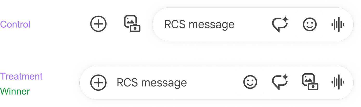
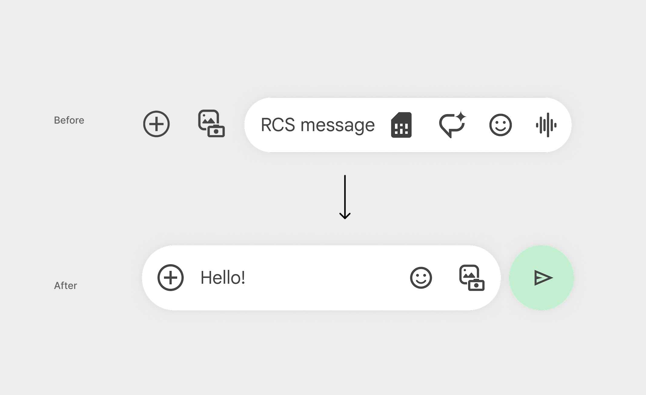
Redesigned the message composition interface to be more intuitive and feature-rich while maintaining simplicity.
The new design provides quick access to AI-powered suggestions and rich media without cluttering the interface.
 Google Messages
Redesigned the message composition interface to be more intuitive and feature-rich while maintaining simplicity.
The new design provides quick access to AI-powered suggestions and rich media without cluttering the interface.
Explored a broad set of approaches in a matrix organized by variants.
Full map of variants
Principles established to narrow down options.
With Data Science, created a progressive experiment plan to test the hypothesis. First, reverting to the original design before the dip in engagement, then tested incremental changes until the desired result.
Step 1: Revert to original design

Step 2: Move important actions to the right
Step 3: Remove and reorder actions
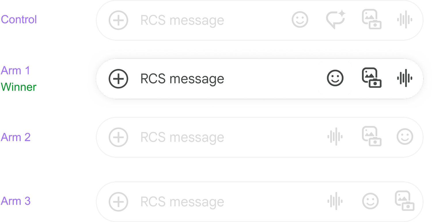
Step 4: Move voice action outside of input box
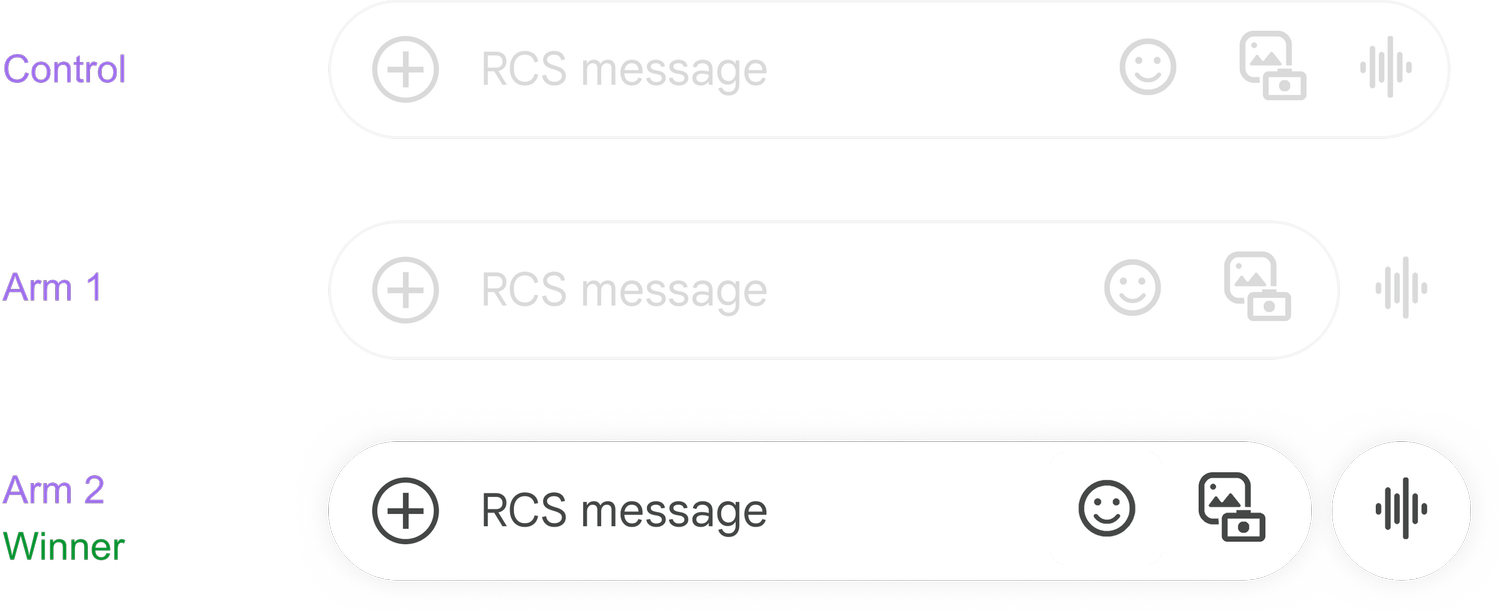
Step 5: Visually group actions
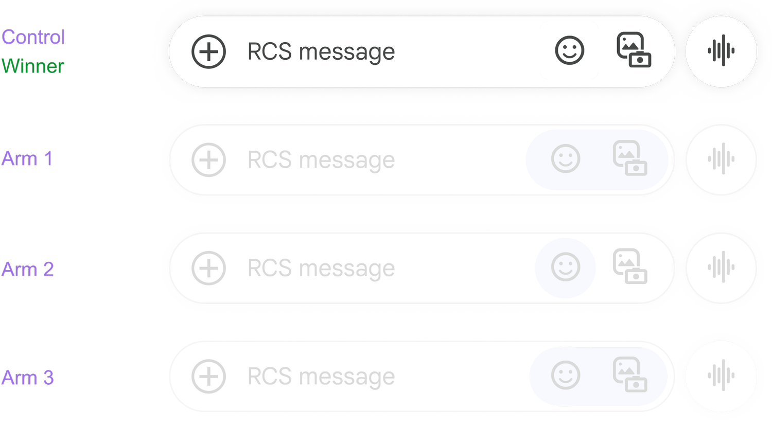
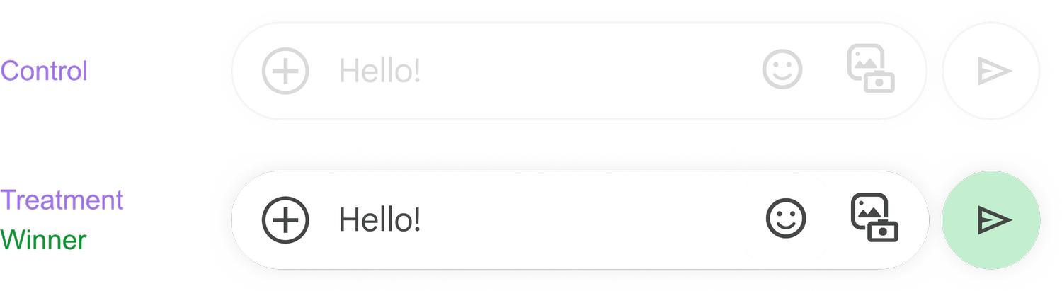
Step 6: Apply color to send action
Step 7: Taller container
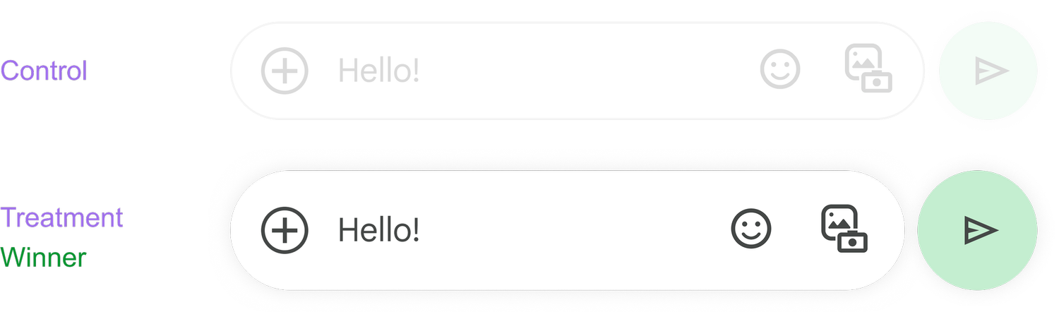
The effort included both a phased design and testing approach, resulting in recovered metric losses and increased voice message usage by 5.7%.
Additionally, having a taller text input box, support for more text, and bold coloring of the Voice / Send buttons created brand differentiation from competitors, a priority for Google.
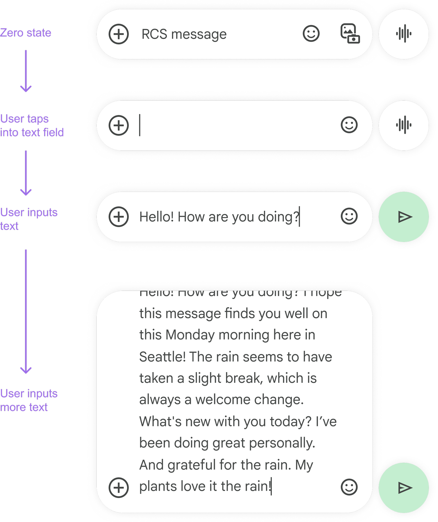
All compose states:
Press
Google Messages is finally doing something about its annoying compose box limit - Android Authority
Google Messages could make it easier to view your lengthy texts before sending them - Android Police