Back
Google Messages Google Messages
Token Color System for Theming
Updating design system to indicate modern chat capabilities
Role
Product strategy
Visual design
Collaborators
Jason Cho - Design Systems Lead
Overview
Overview

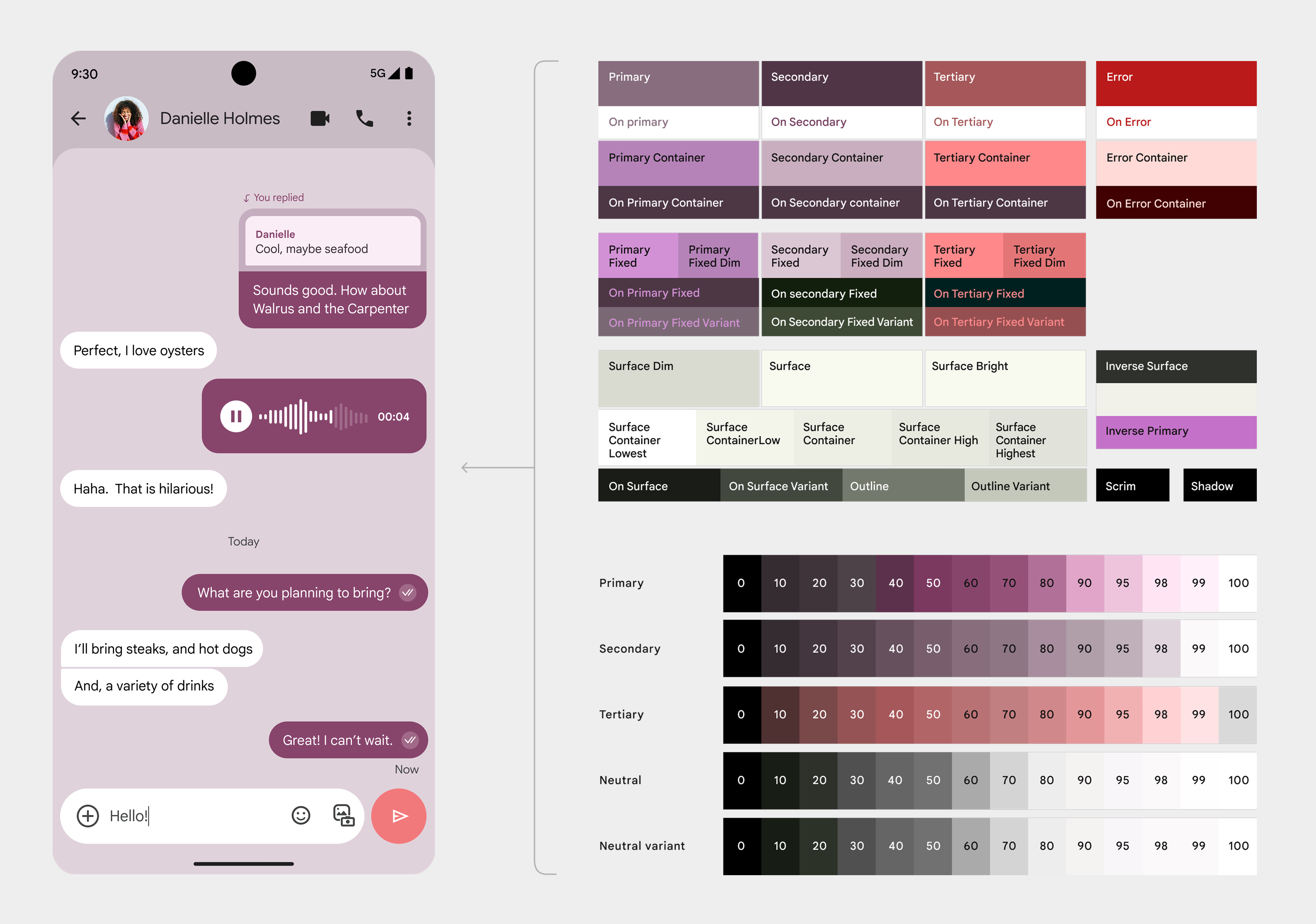
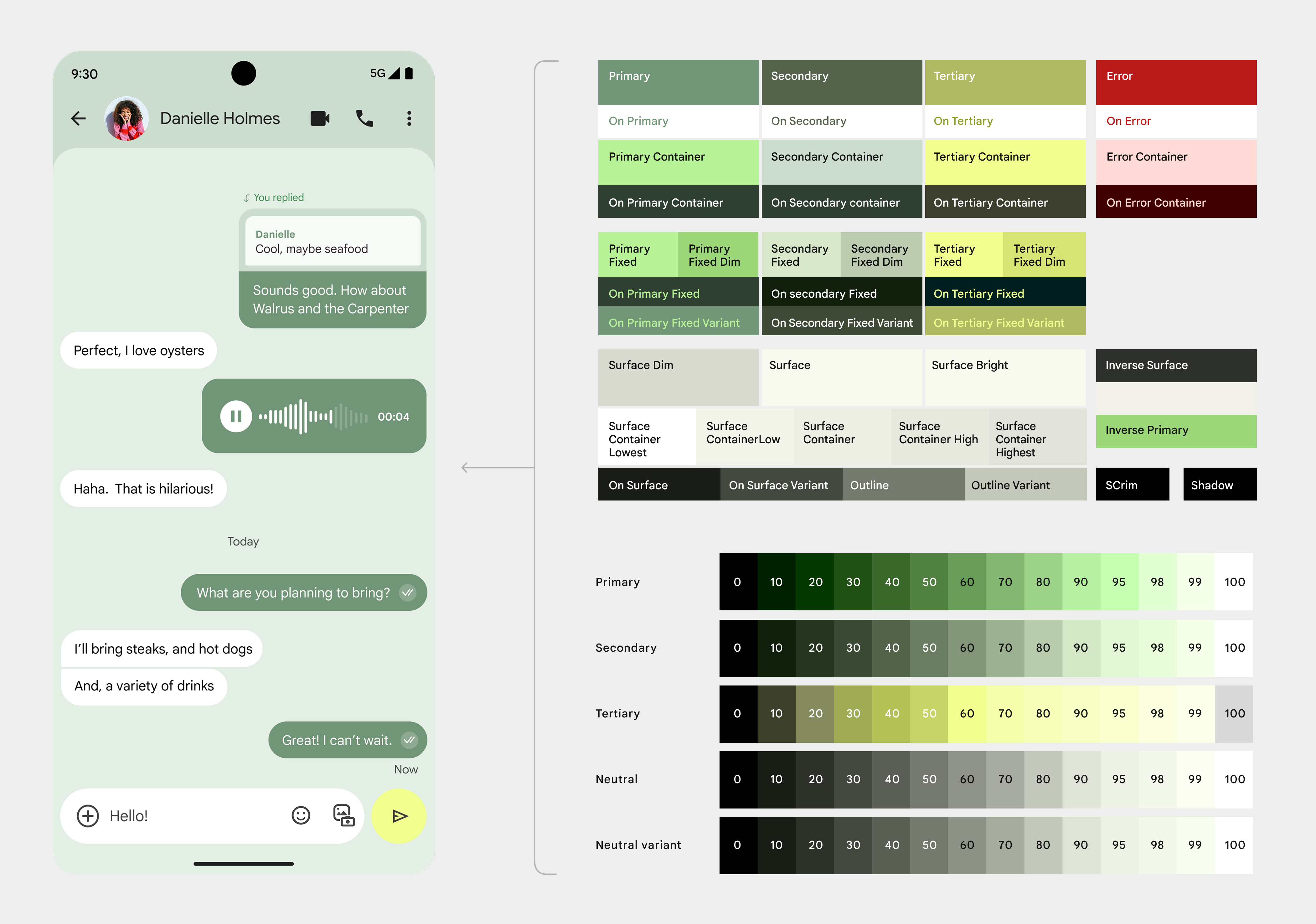
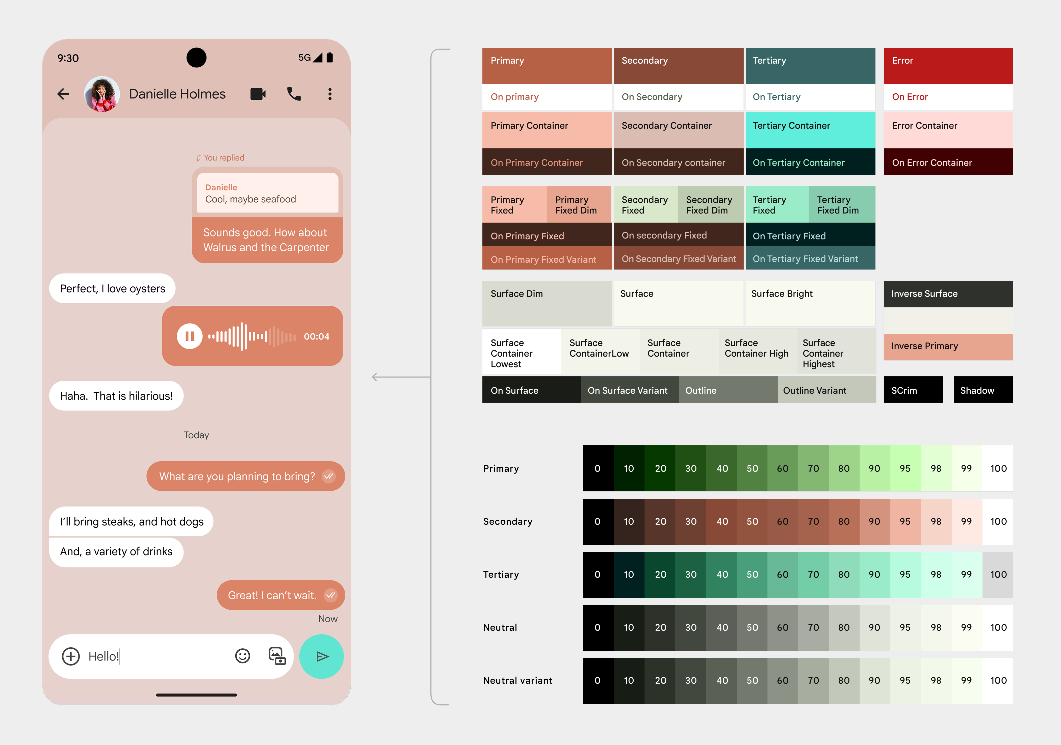
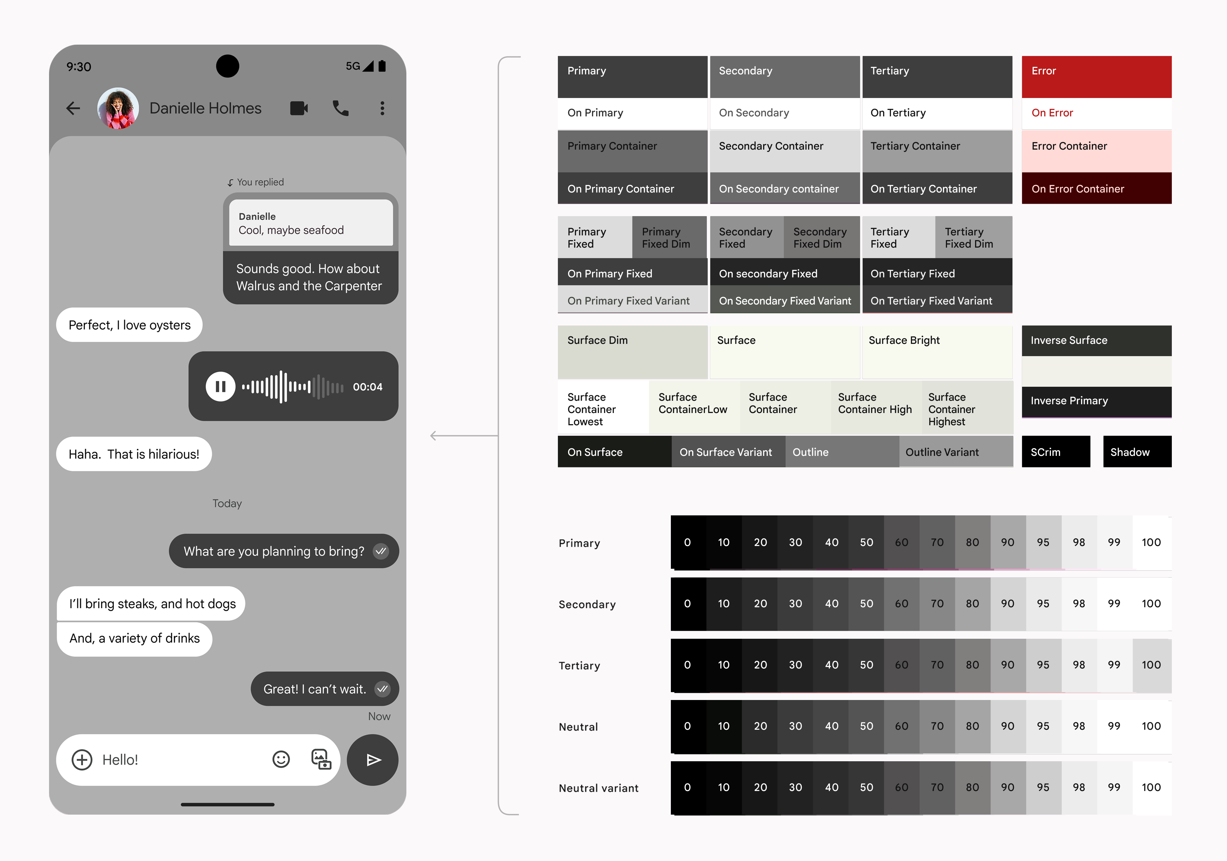
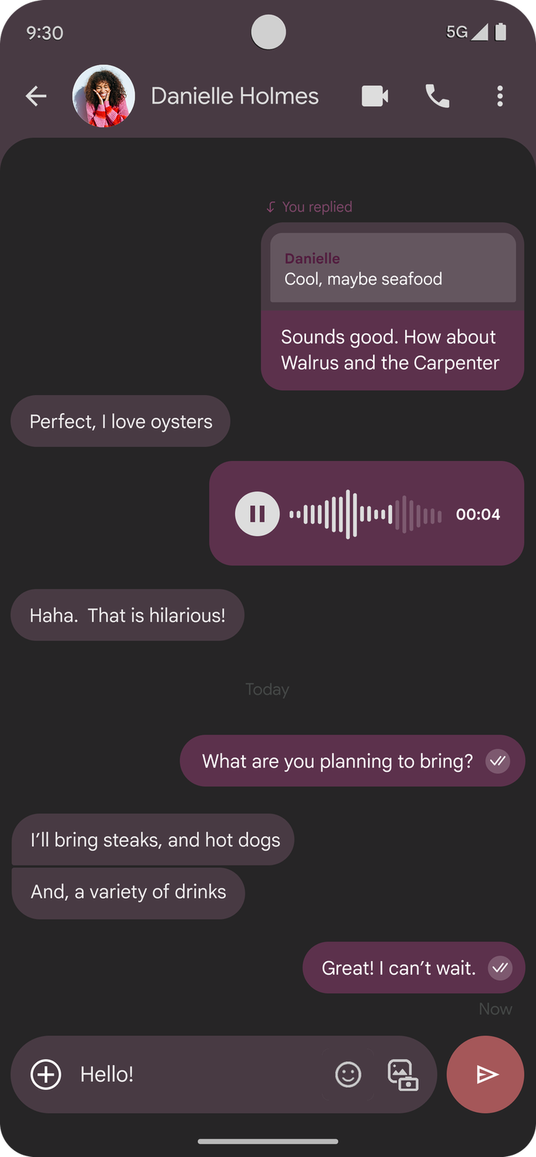
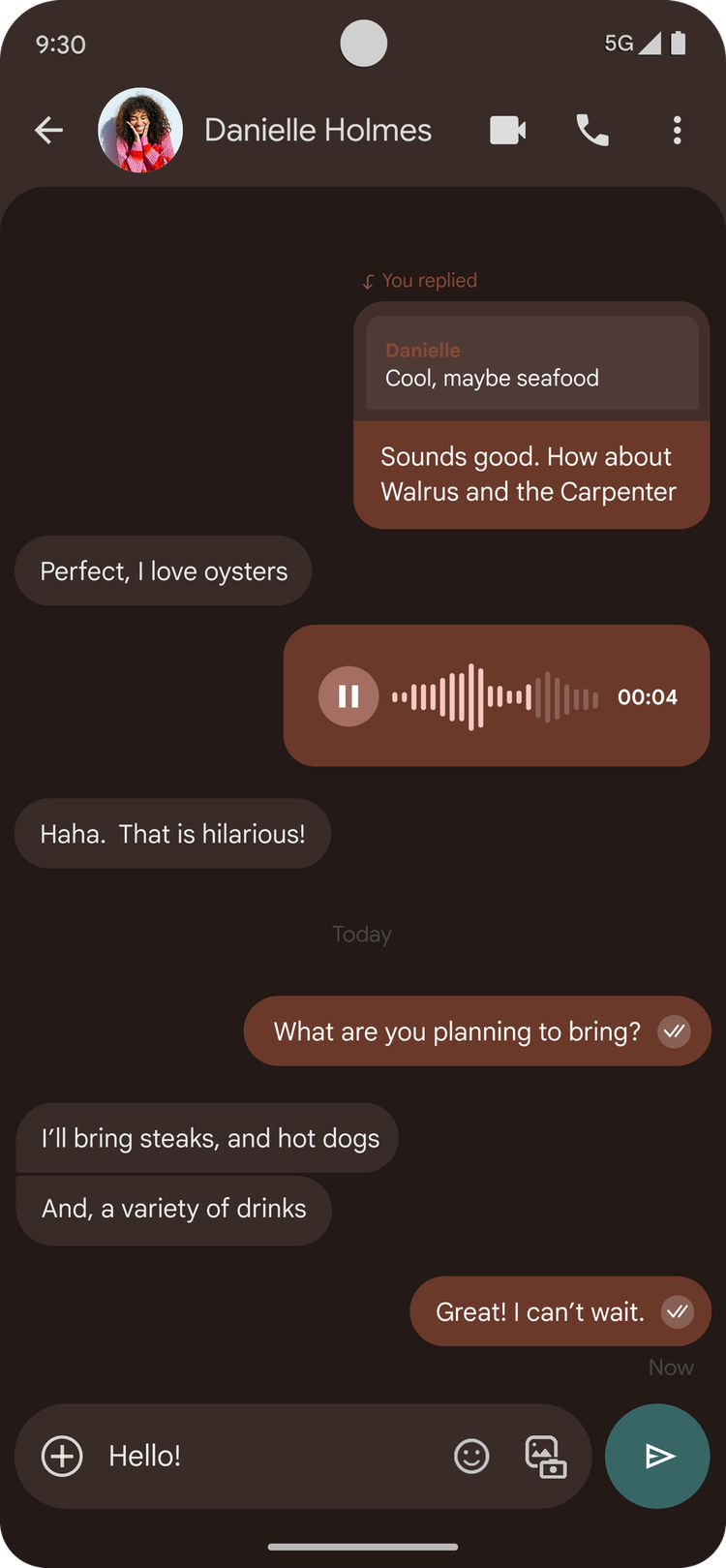
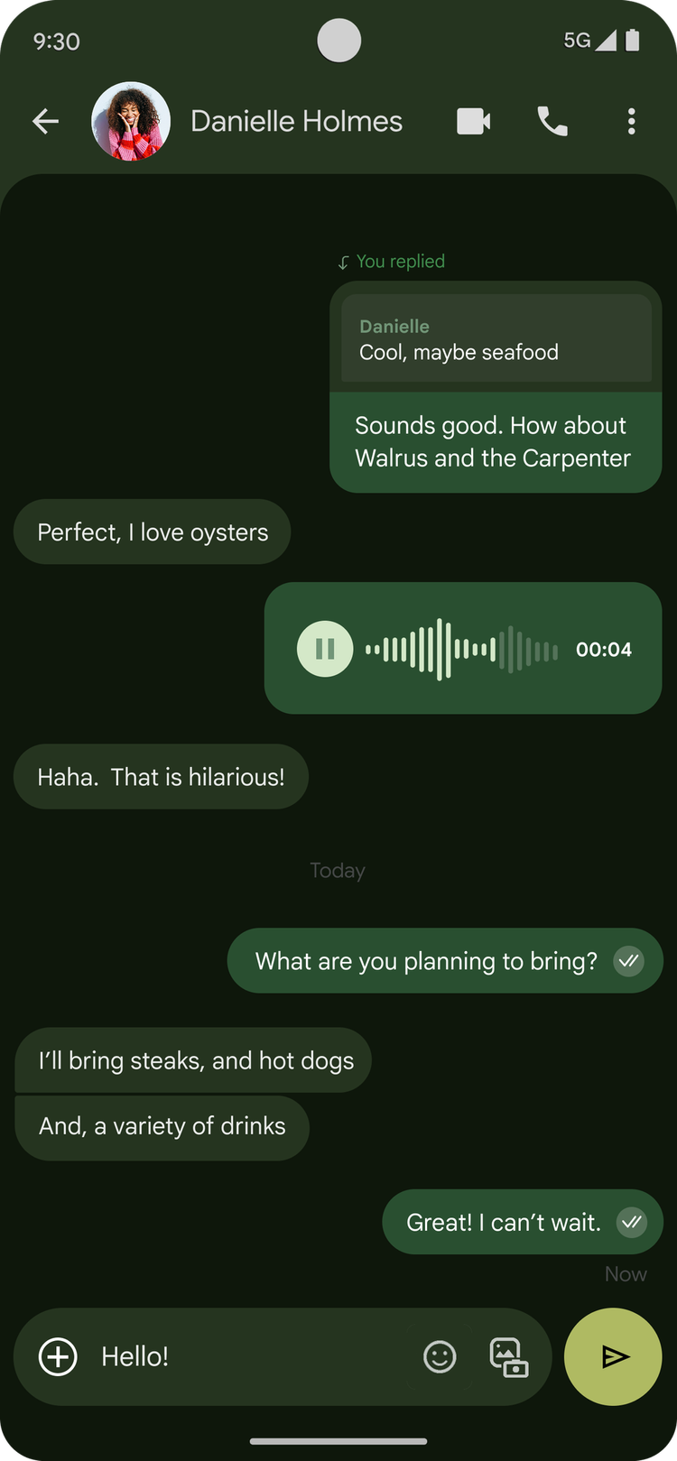
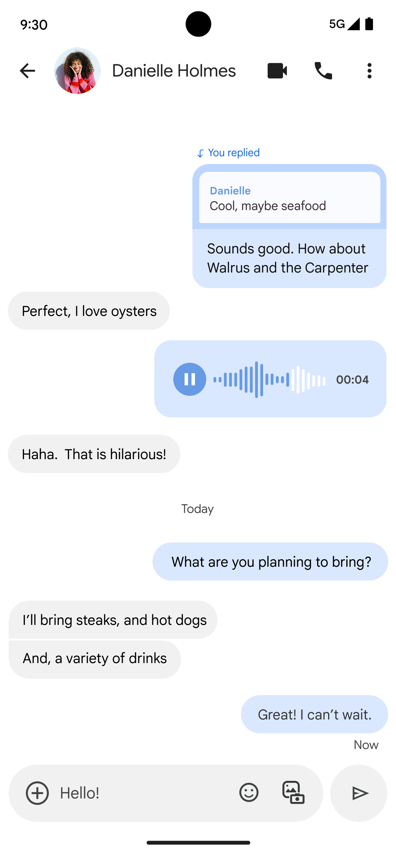
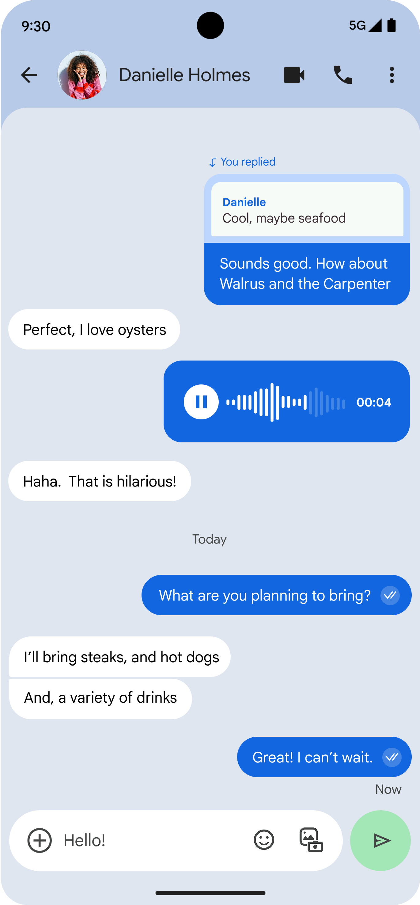
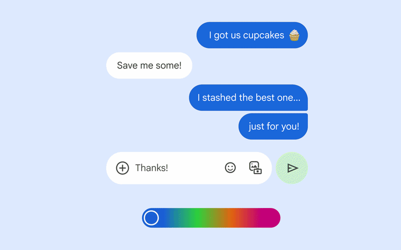
Developed a comprehensive color system for Google Messages that ensures consistency, accessibility, and expressiveness.

Critically, the new palette's goal was to communicate the premium features that RCS offers.

The system adapts seamlessly between light and dark modes while maintaining visual hierarchy and brand identity.

Color palette
Color palette 1
Color palette 2
Color palette 3
Color palette 4

The Messages color system leverages Material Design "You," which assigns values to tokens algorithmically and guarantees passing of a11y.

Previously, the color system was designed for white backgrounds. We decided to apply color to the background, which meant every color token had to be redefined to pass a11y and look aesthetically cohesive.

Dark mode
Dark mode 1
Dark mode 2
Dark mode 3
Branding the Send button
Compose 1
Compose 2
Compose 3
Compose 4
Compose 5
Compose 6

The application of an accent color to the Voice / Send button piques visual interest and encourages engagement with the most critical action.

Outcome
SMS
Outcome 1
RCS
Outcome 2

Research highlighted that users perceived the updated color system as "modern," "cool," and sufficiently differentiated from SMS chats. Further, the new system mapped to Google's goal for a more expressive phone experience.